Content brought to you by Motor Age. To subscribe, click here.
What You Will Learn:
• HVAC diagnostics doesn't always require the recovery of refrigerant
• The enthalpy chart helps to eliminate a fault in the refrigerant loop to save time and prevent misdiagnoses
• With comprehension and practice, the enthalpy chart will increase your diagnostic accuracy and efficiency
We have known for some time that the old rules of thumb used in automotive HVAC service have been marginally accurate at best. We know that an accurate refrigerant charge provides the most efficient operation in a normal system and promotes lubricant flow. Even slightly undercharged systems can suffer from a lack of lubrication. Reduced system capacities in newer vehicles have made charge accuracy more critical to proper operation, and it’s crucial we as technicians get it right.
Accurate evaluation sets the course from proper analysis
Q: When presented with a system to evaluate, what tools do we have?
There are manufacturer-specific performance tests that are made for a specific make, model, and year applications. These are found in service information and are designed to help place the vehicle and system in a specific state. Only then can the performance of the system be measured accurately under the conditions present. Examples of vehicle conditioning may specify if the vehicle is in the sun or the shade. Are the doors or windows open or closed and by how much? The system settings are specified and allowed to stabilize under those conditions. Then the temperatures and pressures are measured and compared to published specifications based on ambient temperature and humidity levels. Again, this test is platform-specific and based on system design, volume, and refrigerant. There is no generic HVAC system performance test that fits all. There are less precise tests like “temperature difference between ambient and vent,” with a goal of a specific drop. These may not be as accurate an assessment of a system as the manufacturer-specific performance test.
Q: If the results of a test are sub-standard what is the next step?
There are specific temperature tests like “temperature delta across the evaporator” on an orifice tube system. A properly operating system should measure very close to the same temperature at the inlet as the outlet. It is hard or nearly impossible to use this test on an H-block system. We can measure the temperature delta across a condenser and apply the old rule of thumb, looking for a 20-50 degrees F change. Some vehicles have built-in scan tool tests or data we can turn to for guidance. Examples would be Toyota vehicles with a “refrigerant volume check” utility or Chrysler Jeep vehicles with a “Cool Down test” utility. There are data PIDs for some systems that are particularly useful, but that is another topic.
All too often we see vehicles hooked up to recovery and recharge machines. The system is recovered and recharged with the specified quantity of refrigerant as a starting point in diagnostics. This is what prompted the search for other techniques of evaluating vehicles. It takes time, and we are not even sure it is needed. With the introduction and spread of R-1234YF, we have added time to the cycle as well as cost.
 holds significance to the operation of the HVAC system's performance.")
Enthalpy charts for a faster dynamic evaluation of HVAC performance
Q: What if there was a way to watch the system work?
What if we could graph the data and gather a direction pointing toward an internal or external cause of poor performance? The use of an enthalpy chart for a specific refrigerant system is another tool we can use. This can be done manually with a printed chart, or we can use a tool that gathers data and plots it for us.
Q: What are we truly seeing when we look at a plot on an enthalpy chart?
Simply put, for our purpose, we are seeing the energy in the closed system change as it exchanges heat with the surrounding environment. Knowing what a good system looks like, we can identify where we should look for performance concerns. The first step is getting familiar with the elements of an enthalpy chart. For our purpose, we will not be using the full charts, as they have elements that are not necessary for evaluating a system. The level of information can make them extremely hard to read and distracting. The simplified dome-shaped chart here was designed for use in CarQuest Technical Institute (CTI) classes covering the topic (Figure 1).
The left side of the chart is scaled in PSIa (or, absolute). This is important if one is filling in their own chart. Reading the gauges on our tooling, we may need to convert from the gauge reading to an absolute value. If we are at sea level, we would need to add 14-15 pounds to the PSIg (or, gauge) readings for them to then equal a PSIa reading. The numbers on the bottom scale will not directly be used in creating our chart. The green scale and lines are for entropy and are placed on our chart for one important reason. When we chart the compression of the gas, it will parallel these lines to the right of the dome and help us draw an accurate chart. More on this in a minute.
Q: What is this dome on the chart?
Staying outside of the dome, everything to the left of the dome is representing the refrigerant in a completely liquid state. Everything to the right of the dome is fully converted to a gaseous state. Everything inside the dome is in transition. It is either changing from a liquid to a gas (as it does in the evaporator). Or it is changing from a gas to a liquid (like it does in the condenser). Notice that there are blue lines, indicating the temperature of the refrigerant. To the left of the dome, they are nearly vertical, and they transition to vertical again very rapidly to the right of the dome. Each line represents a change of 20 degrees F in temperature. Notice the temperature lines inside the dome are flat, indicating a stable temperature. When we learn A/C theory, it tells us that refrigerant changing state can absorb or expel tremendous amounts of heat while it is changing state without changing temperature.

In the condenser, the gas condenses to a liquid. While doing this, the gaseous refrigerant gives off the heat it absorbed from being compressed. It will cool some and then reach a stable temperature while changing to a liquid. Then when the hot high-pressure liquid moves through the orifice of the metering device, the pressure is rapidly dropped and the refrigerant boils, changing from a liquid to a gas again. During this change of state, the refrigerant can absorb tremendous amounts of heat from the cabin without the now gaseous refrigerant increasing in temperature. Therefore, we could measure the temperature of the inlet (on an orifice tube system) and measure the outlet and see little change in temperature from inlet to outlet on a properly operating system.
Only four pieces to this puzzle
Q: How do we use this tool to see how our system is performing?
We need four pieces of data:
The high side pressure (absolute)
The low side pressure (absolute)
Temperature near the compressor inlet
Temperature just before the metering device
This will establish two points on our chart, and the rest of the data can be drawn in (Figure 2). Once we have entered our two points on the chart, it will have what we need to draw in the rest of the information. From the lower right point (representing the inlet temperature and pressure at the compressor), we will draw two lines. The first line will project up and to the right parallel to the entropy lines in green. The other line will be level with the temperature lines inside the dome and project directly to the left into the dome.
The upper left point representing the temperature and pressure just before the metering device will project the last two lines of the complete cycle. This is a representation of a very efficient refrigeration system. The lower flat line inside the dome is representing the temperature inside the evaporator. In this instance, it is representing a low- to mid-thirty-degree temperature. The point at the lower right is indicating superheat of around 20 degrees F.
Superheat occurs when a vapor is heated above its boiling point. Where the lines join at the top right indicates the condition of the system’s refrigerant exiting the compressor. It shows 20-30 degrees F outside the dome to the right as a fully saturated gas. Once it moves to the condenser and drops that 20-30 degrees F of excess heat, the gas will change state to a liquid and the temperature will flatten out as described in A/C theory. Once it is fully saturated as a liquid (as indicated by the upper left point we plotted), it will pass through the orifice and change to a blended state where it will boil off absorbing heat.

A picture is worth a thousand words
Just like other systems on the vehicle, we can look at the information in different ways. For example, we can measure battery voltage at a moment in time with a DVOM. We can also graph voltage over time with a DSO. We can read scan data in digital form, or we can graph. A picture can sometimes be easier to comprehend when we are trying to evaluate information, and HVAC data is no different. The following will be a series of charts to introduce this type of evaluation. This type of analysis can save time and money if the fault with the system is not due to low refrigerant and is instead an airflow or other external issue (like a blend door control).
Looking at the chart on a system that is running well, one should notice that there are no large excursions outside the dome (Figure 3). A system that goes far out to right into “superheat territory” is using a lot of energy that should not be needed. The point at the top right should typically be within two or slightly more temperature lines. Most systems will have temperature drops across the condenser of less than 50 degrees F. More than that and we should be looking for a low charge or air in the system. The next chart shows an example of a low charge (Figure 4). One of the clues to low charge is the bottom line of the chart. It is indicating the evaporator is operating BELOW freezing, but the system is not performing that well.

These charts are captures from the Yellow Jacket Mantooth wireless manifold set. The screen capture runs live so you can see changes during operation. Cycling fans and setting changes will cause the chart to change accordingly. To review, Figure 3 shows a fully charged, properly functioning system. The chart is very close to the dome with little wasted energy. They will not all be that close to perfection, but it is a good baseline. Figure 4 shows a system with a low charge. The increase in superheat and the evaporator line below freezing are both good indicators that the system requires service.
Figure 5 demonstrates another type of failure that we induced on the same vehicle as the vehicle in Figures 3 and 4. In this chart, the cooling fans are disabled. Notice a couple of things (Figure 5).
The high side pressure has risen to the 300-psi range, yet the system is still cooling under current conditions. This can both be felt at the vents and is supported in the data of the evaporator line being just above freezing. The saturation temperature is still 32.4 degrees F, yet the system is working hard to get there. This quickly indicates there is something wrong.

Expert evaluation instills confidence in your customers
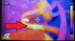
The last example I want to share with you is an example of how a technique like this can change the conversation with a customer and provide diagnostic confidence. This chart was one created with testing a vehicle with a failed blend door (Figure 6). The vent temperature on MAX A/C was 133 degrees F once the engine was fully warmed up. The vehicle came in hot and was checked out with the client waiting. This question was asked: Will the A/C be cold once the blend door is fixed?
The door on the vehicle could be repaired externally. The A/C system did not need to be disturbed, but did it require attention? Remember our methods of testing? We cannot verify the actual temperature change from ambient to vent for this vehicle (blend door stuck) and we cannot get data for a specific system performance test. Plugging our numbers into an enthalpy chart showed the A/C evaporator was showing a good saturation temperature for cooling (about 33 degrees F). The client can be told with confidence that the system will perform well once the blend door is working.
Learning to evaluate information in different ways is the way to develop an edge. Providing efficient service experiences to our clients helps build value in our business. Whether you plug numbers into a chart you create or pick up a tool that helps graph the data, I encourage you to give this method a try. Like any other testing technique, it takes a little practice to get comfortable. Once that is accomplished answers are only minutes away.